Themes and design
Pick a look, adjust how it reads, and see all of it before it goes live.
Everything visual about a blog lives in one place: Settings → Appearance. There is no CSS to write, no template to fork, and no theme to install. You choose a theme, then adjust a short list of things about how it reads. That is the whole surface.
The theme picker
Edit appearance opens a full-screen picker with two tabs: Choose theme and Customize. The header tells you which theme is currently applied, and the right-hand half of the screen is a live preview of your own blog — your posts, your title, your nav — not a stock mockup.
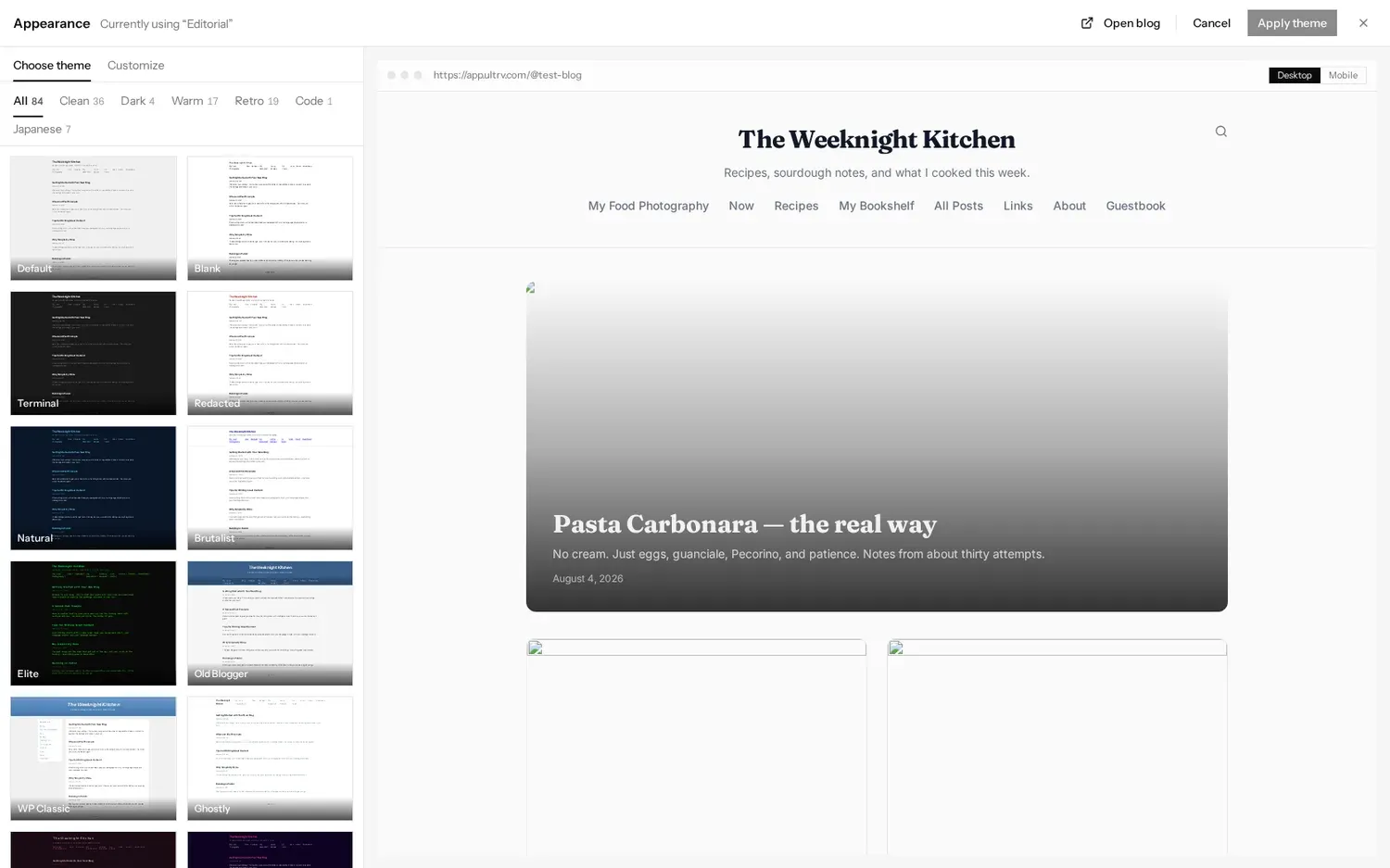
There are 84 themes, filtered by seven tabs across the top of the list:
- All — 84
- Clean — 36, the plain-text end: Default, Blank, Swiss, Tufte, Notebook, Broadsheet
- Dark — 4, including Terminal, Elite and Synthwave
- Warm — 17, softer palettes: Cottagecore, Polaroid, Herbarium, Art Deco
- Retro — 19, the web that was: GeoCities, LiveJournal, Xanga, Vaporwave, Y2K
- Code — 1, Syntax
- Japanese — 7, Tegami, Washi, Ukiyo-e, Kintsugi and others
The theme gallery shows all of them at a readable size if you would rather browse before you sign in.
Preview, then apply
Clicking a thumbnail changes the preview, not the blog. Nothing your readers see moves until you press Apply theme. Cancel throws the whole session away and leaves you where you started, and the Desktop / Mobile toggle above the preview shows how the same choice behaves at phone width. Switching themes later costs nothing — posts are stored as content, not as markup tied to a design.
The appearance summary
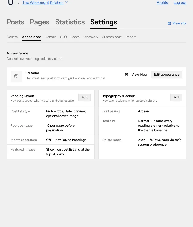
The Appearance page itself is a summary rather than a control panel. The card at the top names the theme in use and describes it in one line. Below that sit two panels, each with its own Edit button, listing the settings as they currently stand.
Reading layout
How posts appear when a visitor lands on a list page. Four settings:
- Post list style — Rich gives each post a title, date, preview and optional cover image; Dense puts the date and title link on one row. Dense suits an archive of hundreds of short entries; Rich suits a blog where the pictures matter.
- Posts per page — 5, 10, 15, 25 or 50 before pagination. Dense lists read well with more on screen.
- Month separators — off by default, giving a flat list. Turned on, entries are grouped under month headings, which is the right choice for a journal and the wrong one for a blog that posts twice a year.
- Featured images — shown on the post list and at the top of posts, or hidden everywhere on the public blog.
Typography and colour
How the text reads and which palette it sits on.
- Colour mode — Auto follows each visitor's system preference. Light and Dark force one for everybody. Auto is the honest default: it is the reader's machine, and they have already told it what they want.
- Palette — a row of swatches, for the themes that ship with more than one colourway. Themes that have a single fixed palette do not show the row.
- Font pairing — ten named pairings of a heading face and a body face, each previewed in place: System Default, Clean Editorial, Warm Modern, Contemporary, Tech Editorial, Bold Classic, Technical, Artisan, Literary and Sharp Modern.
- Text size — Small, Normal, Large or Extra large. This scales every reading element relative to the theme's own baseline, so it works on all 84 themes rather than fighting them.
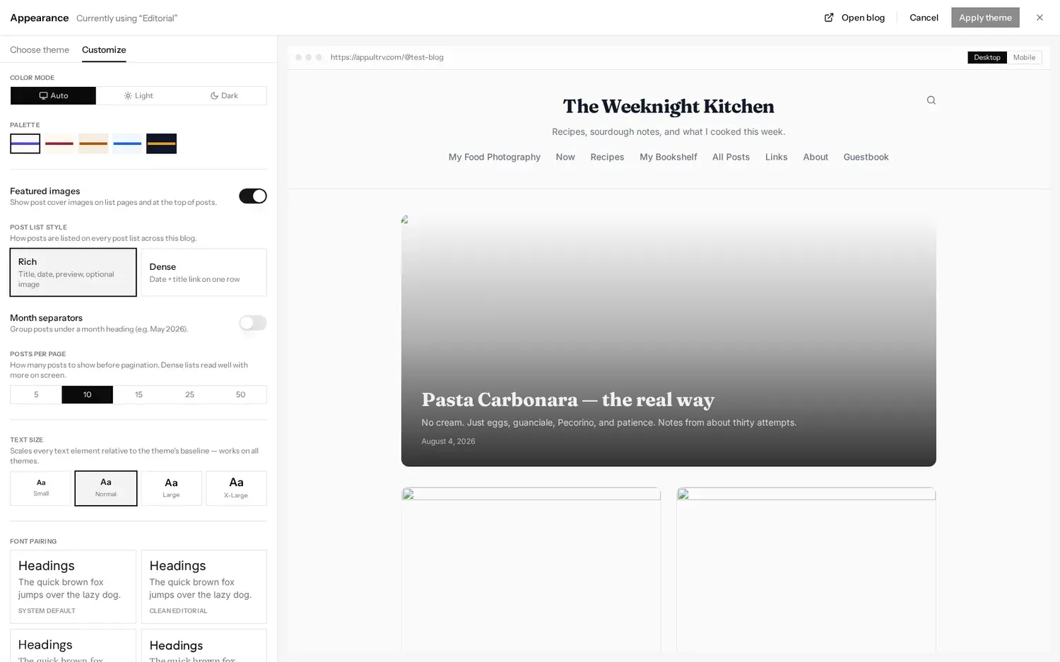
Every control in this rail updates the preview beside it as you touch it, and the same Apply theme button commits the lot in one go. Theme and customisation are saved together, so you can try a Retro theme at Large text on a warm palette and abandon all three with one press of Cancel.
When the settings run out
There is one escape hatch, under
Settings → Custom code: a
Head code field added to the
<head>
of your blog, and a Body code field
added at the end of the
<body>.
They are meant for analytics, custom fonts and meta tags rather than for
rebuilding the theme, and whatever you put there runs on your readers'
machines. ULTRV puts no trackers on your blog; this field is the only
way one gets there.
If the built-in options genuinely do not cover what you need, the REST API and full export mean the content is never trapped behind the design. That is the trade ULTRV makes: less control over the markup, in exchange for nothing to maintain.
Where design meets the rest
Two settings elsewhere change how the blog looks to people who are not looking at it in a browser. A custom domain changes the address in every link and feed, and the feed settings control what subscribers get, which no theme affects.